Smooth Goo
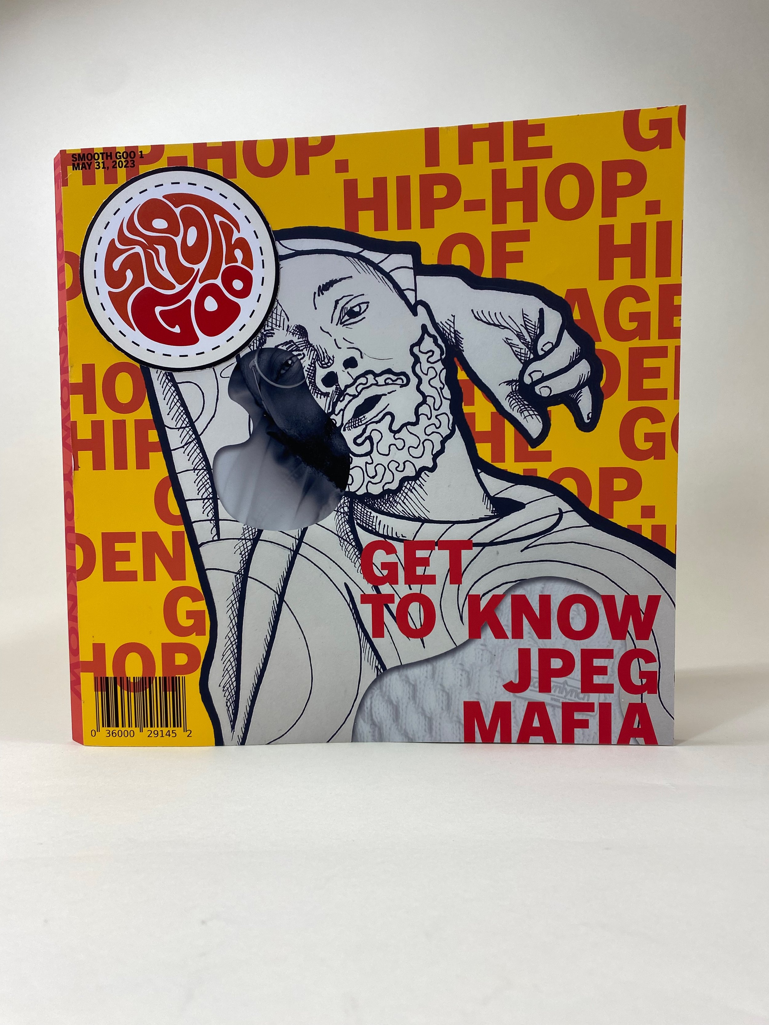
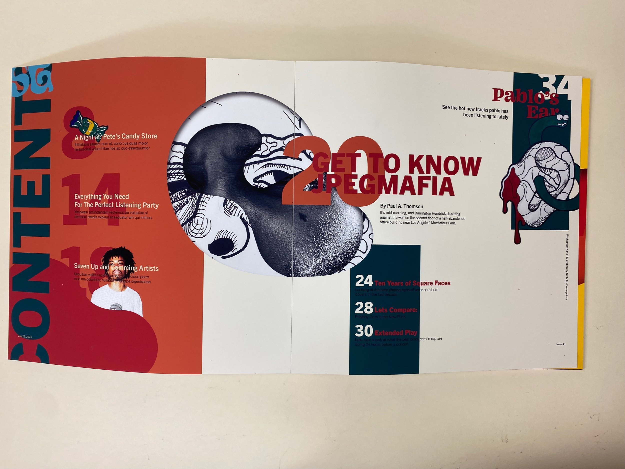
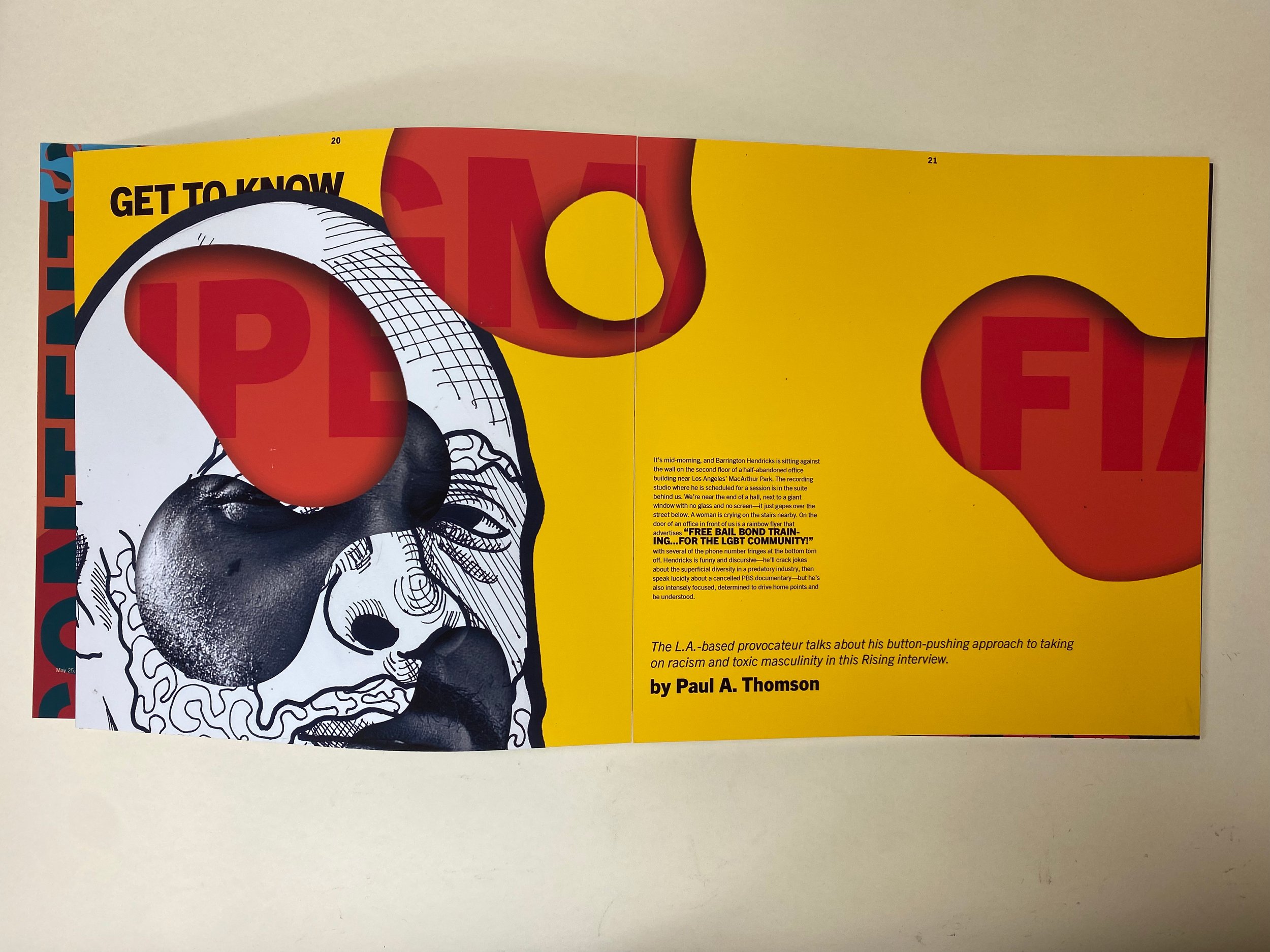
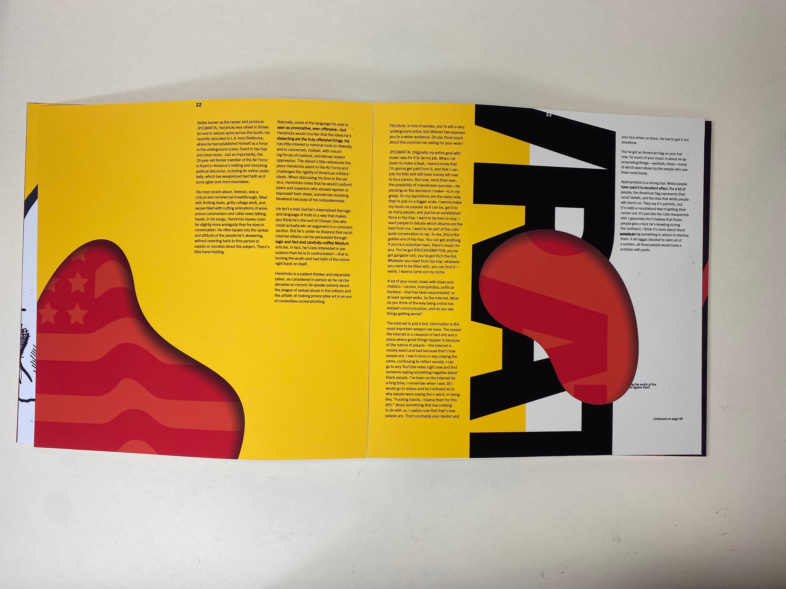
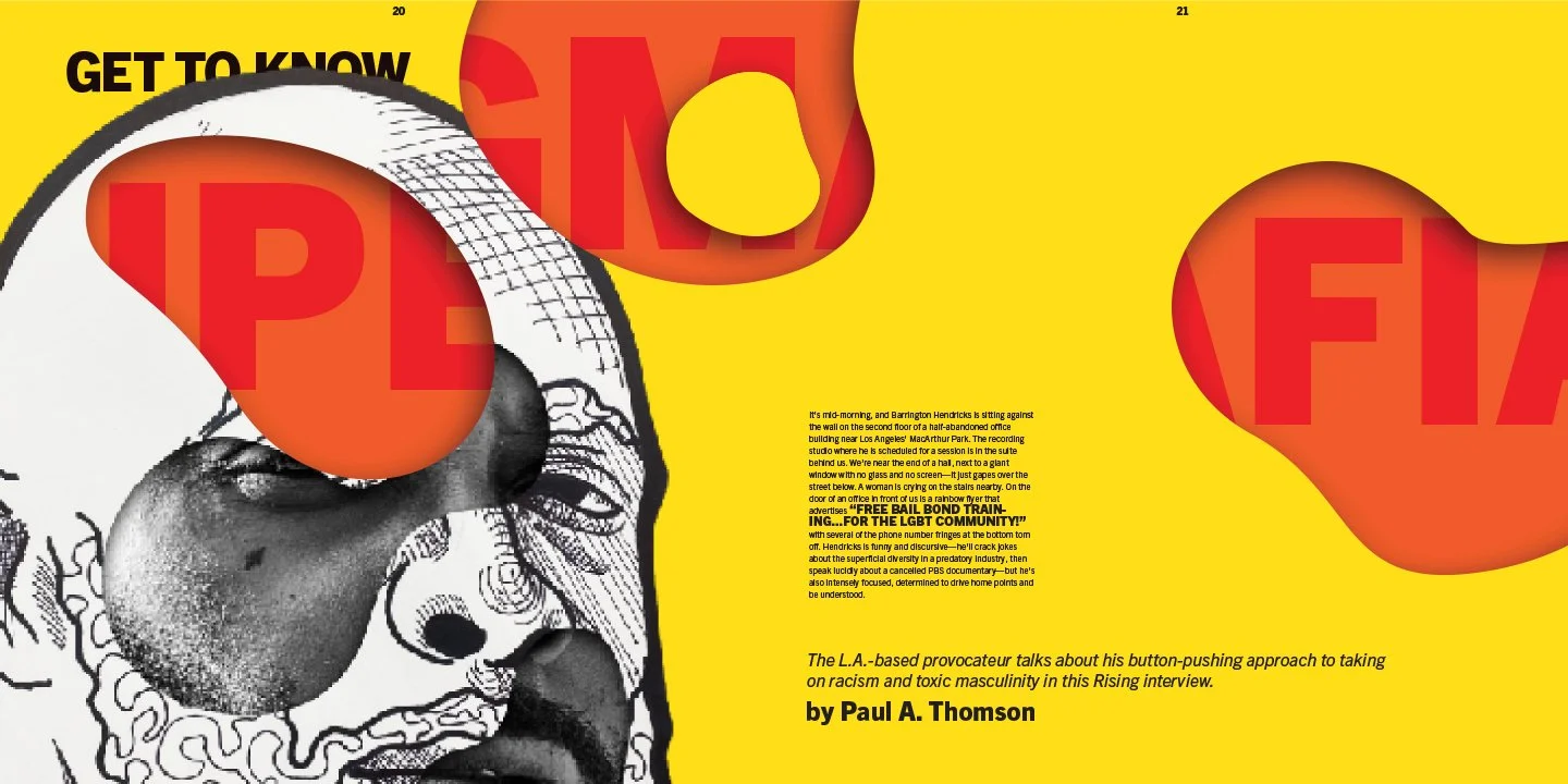
Smooth Goo is an experimental alternative music magazine, releasing on an irregular schedule as it’s produced. The magazine focuses on interviewing smaller underground artists. The magazine’s brand is left field surrealist and unconventional. For this issue I used a blob motif throughout the magazine for its cover article.
Masthead:
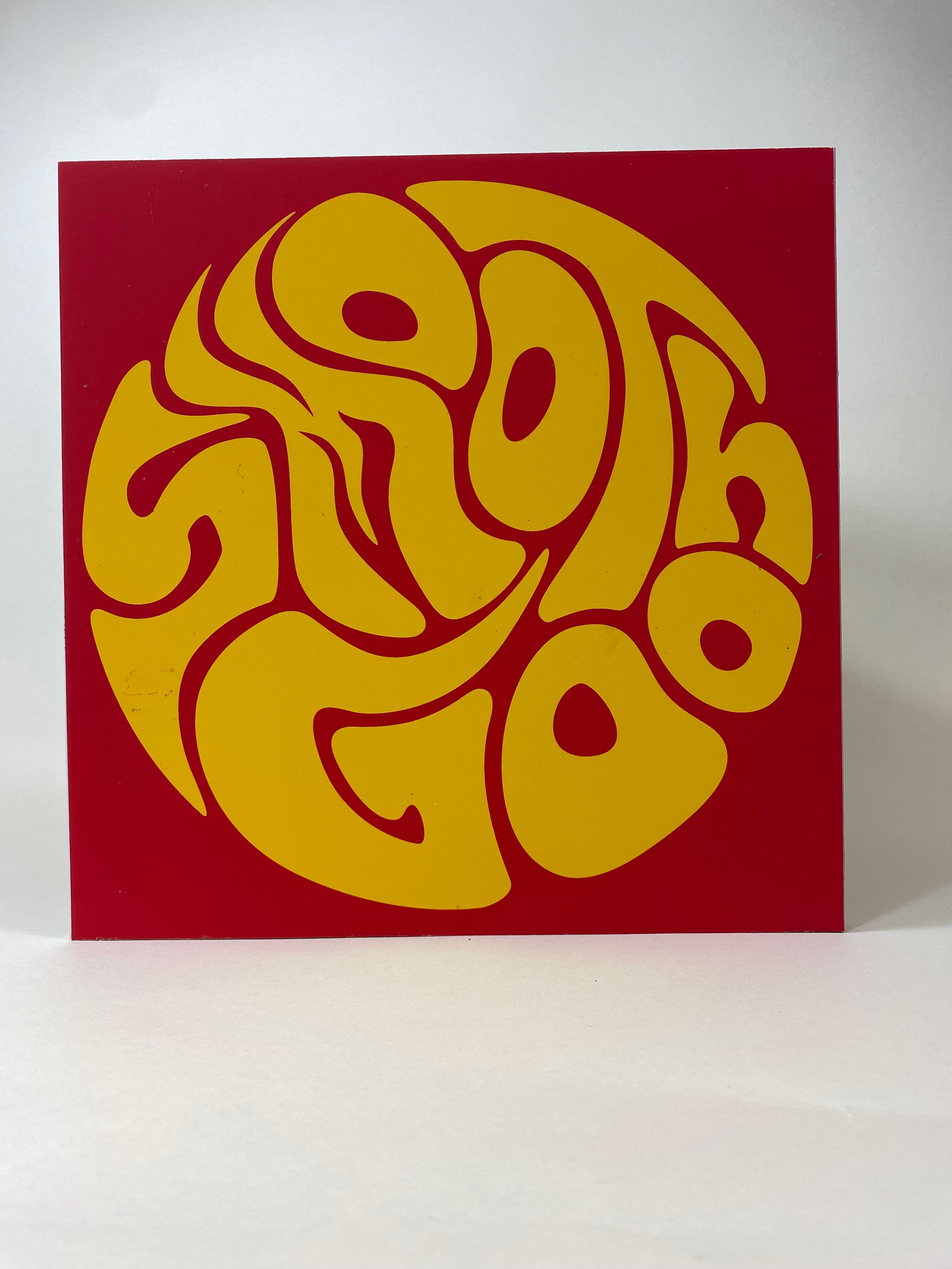
The masthead of the publication is based on 60s psychedelic rock posters, and is designed to be an actual sticker that patrons of the magazine could collect as they buy more issues. It’s not afraid to be slightly illegible or out of the norm for a magazine logo because the goal of Smooth Goo is to develop a niche dedicated fan base, not appeal to a wide audience.
Image Making:
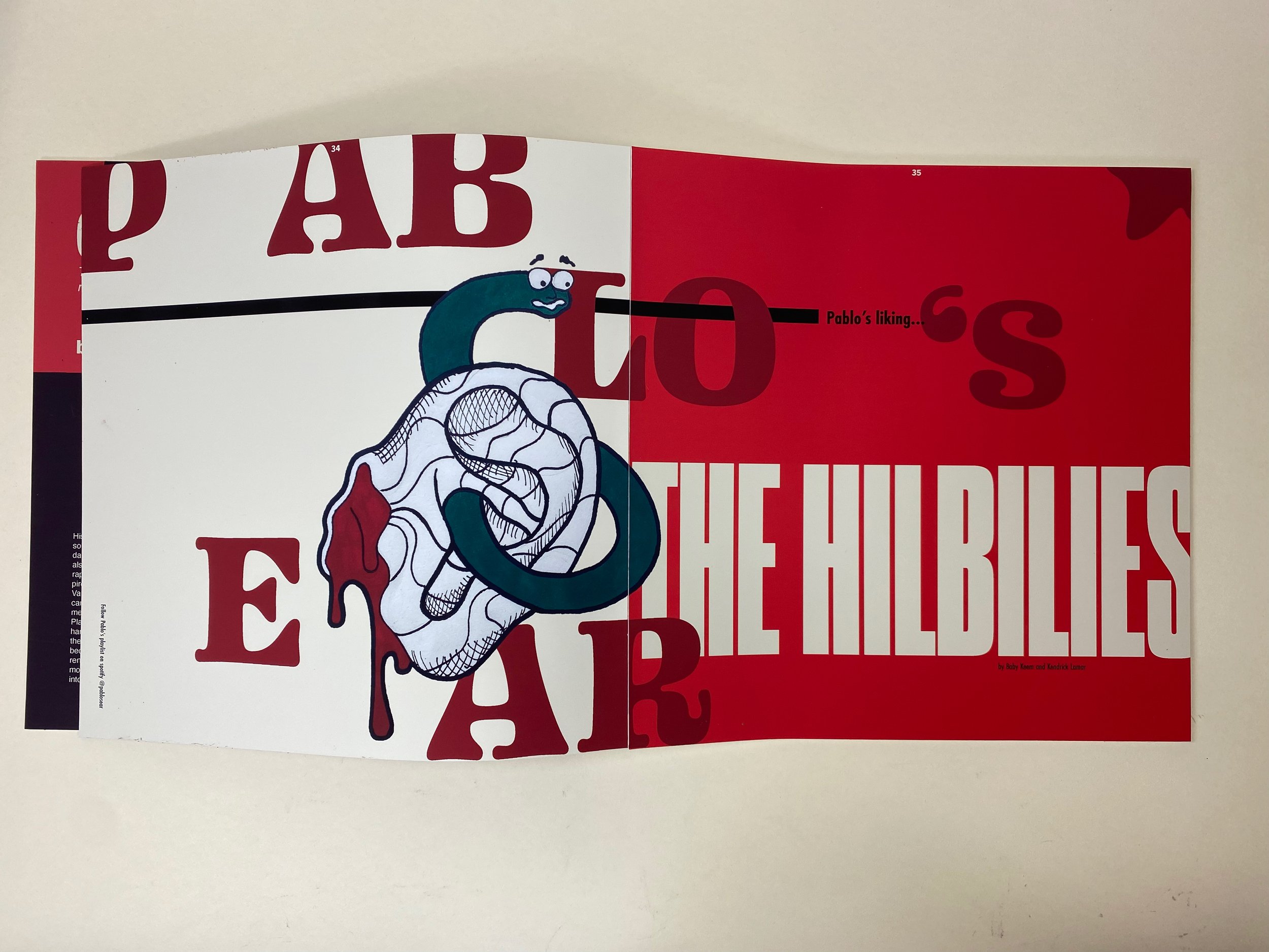
For this issue of the magazine I developed a system using these ambiguous blob shapes as fake cutouts in the magazine. A fun design challenge I had was figuring out different ways to use the blobs. In addition to the organic blob shapes the magazine uses a variety of image making including illustration, photography, and bold typography.
